Wednesday, June 28, 2023

621. The 2023 Alphabet: Z

Z is for 

The Bard of the Dimbovitza
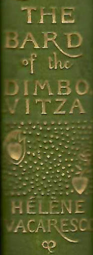


Hélène Vacaresco, The Bard of the Dimbovitza.
Designed by Charles Ricketts
(detail of spine of second edition, 1892)

At the time Ricketts was designing book covers and title pages for commercial publishers such as James R. Osgood & Co, he created a design for Hélène Vacaresco's first series of poems, The Bard of the Dimbovitza, 'collected from the peasants' as the title page proudly stated and translated from Romanian by Carmen Sylva and Alma Strettel. The first edition appeared in 1891 in a tan cloth binding and in a parchment-bound deluxe edition. Later editions and the second volume were executed in green cloth.

Hélène Vacaresco,
The Bard of the Dimbovitza.
Designed by Charles Ricketts
(spine of deluxe edition, 1891)


For the spine, a brass plate was made after a drawing by Ricketts. None of the lettering on the spine was set in lead type, but designed by Ricketts, and stamped from a plate. 

This can be observed, for instance, in the difference between characters that should have been identical, such as 'T' in THE', which is sans serif, while in  'VITZA' it has serifs.  Then again, the 'Z' next to the second 'T' has no serifs. The length of the tail of 'R' in the title is slightly less exuberant than that in the author's name. These characters have not been typeset. 

It is one of the few times Ricketts had to design the letter Z for a title - as an initial it does not appear in his oeuvre.

Hélène Vacaresco, The Bard of the Dimbovitza.
First Series and Second Series
Designed by Charles Ricketts
(spines editions dated 1892)

When the second series was published - seen here in a later printing next to a later printing of the first series - the plate for the spine had to be altered and space was made for the designation 'Second Series' by replacing the word 'THE' at the top, and, in fact, the entire section above the author's name has been revised to create space. (Thanks are due to Martin Steenson, Books & Things, London, for his observation.) The lower part of the plate remained untouched. This was done by a professional at the bindery, as was the custom at the time. Ricketts was not called in to make this change after the first series was published. The short dash between 'VITZA' and the series designation is inconsistent with Ricketts's design ideas.

Publishers did not want to spend money on such changes and while authors and publishers could complain about copyright violations, for artists, this right simply did not exist.

An Index to the 2017-2023 Alphabet:

A - 286. The 2017 Alphabet: A

B - 289. The 2017 Alphabet: B

C - 291. The 2017 Alphabet: C

D - 301. The 2017 Alphabet: D

E - 303. The 2017 Alphabet: E

F - 305. The 2017 Alphabet: F

G - 306. The 2017 Alphabet: G

H - 307. The 2017 Alphabet: H

I - 309. The 2017 Alphabet: I 

J - 310. The 2017 Alphabet: J

K - 313. The 2017 Alphabet: K

L - 314. The 2017 Alphabet: L

M - 316. The 2017 Alphabet: M

N - 320. The 2017 Alphabet: N

O - 321. The 2017 Alphabet: O

P - 334. The 2017 Alphabet: P

Q - 335. The 2017 Alphabet: Q

R - 338. The 2018 Alphabet: R

S - 345. The 2018 Alphabet: S

T - 381. The 2018 Alphabet: T

T - 382. The 2018 Alphabet: T [a special celebratory installment]

U - 385. The 2018 Alphabet: U

V - 386. The 2018 Alphabet: V

W - 390. The 2019 Alphabet: W

X - 619. The 2023 Alphabet: X

Y - 620. The 2023 Alphabet: Y

Z - 621. The 2023 Alphabet: Z

& - 397. The 2019 Alphabet: &

Wednesday, June 21, 2023

620. The 2023 Alphabet: Y

 Y is for 

You must wake and call me early

Initial 'Y' in Alfred Tennyson, Lyric Poems (Vale Press, 1900)

Ricketts designed two different initials 'Y', the first one, done for Daphnis and Chloe (1893) was also used in the Vale Press Keats edition in 1898. 

A smaller initial 'Y' appeared in Milton's Early Poems in 1896, and was used in several other Vale Press books. Its final appearance was in the edition of Tennyson's lyric poems, published at the end of 1900.

It is a five-line floral initial with twirling stems and small flowers.

Wednesday, June 14, 2023

619. The 2023 Alphabet: X

Years ago I started a series on initials and letters that Charles Ricketts designed for illustrations, for commissioned books or for his Vale Press editions and we almost got to the end, but I could not find any examples for X and the series was temporarily suspended. 

Initial X designed
by Charles Ricketts

I had overlooked the specially designed enlarged initials based on the Avon Type used for the title-pages of his 39 volume Shakespeare edition from 1900 tot 1903 as well as for the identically executed single-volume edition of Doctor Faustus by Marlowe. These series of initials came in two sizes that were combined on the title-pages. The larger ones were also used to introduce the first text line of each play. 

X is for


A Most Pleasant and Excellent Conceited Comedy of Sir John Falstaff and the Merry Wives of Windsor

William Shakespaere, A Most Pleasant and Excellent Conceited Comedy
of Sir John Falstaff and the Merry Wives of Windsor
(Vale Press, 1902)

The Avon Type was specially designed for the Shakespeare so that the lines were less wide and the pages could contain more text.

The title-pages always contain only the title, however short or long. In the case of the Sonnets or Doctor Faustus, not even a single line was filled, but Ricketts refrained from decorations on these pages, as they were followed (two pages later) by two opening pages containing both the publisher's device and a decorated text page, the latter with a border that differed for the three types of plays (tragedies, comedies and histories).

But he did do something else that would raise eyebrows and showed that the criticism of his early title-pages would not stop him from carrying out such practices in a different way. As we saw in A.L. Cotton's criticism [read blog 616. Ricketts and an Attack on Him by a 'Fool'], he had in the past used a peculiar alternation of capitals and lowercase letters on opening pages. However, Cotton praised the restraint in the decorations of the Shakespeare volumes. Did he overlook the title-pages or did he consider the combination of two formats of initials on the purely typographical pages to be according to the rules?

William Shakespeare, The Excellent History of the Merchant of Venice
(Vale Press, 1902)

On these title-pages, we see idiosyncratic word breaks, the letters of one word are often in two sizes, even names are not sacred - like that of FALSTAFf - and quite often two smaller characters are placed on top of each other, or one is placed above an asterisk.

This was not necessary, of course; with careful measuring and drawing, the titles could also have been set in smaller initials only. Even the larger initials would have fit, although this would have resulted in many more hyphenations. As is often the case, we do not know what Ricketts's thoughts on this were. But I assume both regular solutions would have seemed uninventive and boring to him.

What is clear is that he also saw these pages as decorations, and let's face it: everyone pretty much knew these titles by heart. A single key word - Hamlet, Othello, merry, merchant - sufficed.

Wednesday, June 7, 2023

618. Charles Shannon's Studio in 1920

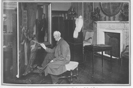
Shortly before and after World War I, Ricketts and Shannon were occasionally surrounded by film crews and were, as Ricketts wrote, 'cinema'd'. But they were also frequently photographed. One such photo appeared in the 1 May 1920 instalment of The Sphere.

'Mr. Charles Shannon, A.R.A., in his Studio in Holland Park'
(The Sphere, 1 May 1920, p. 125)

Shannon poses with a brush pointing at an oil painting - he was working on a large version of 'The Convalescent'. The canvas is positioned at an angle in the studio , making the scene somewhat difficult to perceive, not least because immediately behind it is a framed painting with a portrait of a lady.

The painting was acquired by Kojiro Matsukata and probably destroyed when his London warehouse went up into flames. [Read blog 363 about the Matsukata collection.]

Luckily, in 1924, the painting had been photographed; see plate 25 in Charles Shannon (London, Ernest Benn, 1924).

Charles Shannon, 'The Convalescent'

(Thanks are due to John Aplin for finding the studio photograph.)