Wednesday, February 16, 2022

550. A Daphnis and Chloe Provenance (2)

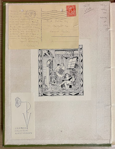
In this sequel about the provenance of a copy of Daphnis and Chloe (1893) in the collection of the Arizona State University Library - see last week's blog 549. A Daphnis and Chloe Provenance (1) - I will consider the more recent bookplate pasted to the reverse of the front cover.

Daphnis and Chloe (Vale Press, 1893)
Collection ASU, Arizona State University Library:
SPEC C-1987

This is the bookplate of Albert Sperisen (1908-1999) that he used only for his collection of Vale Press books. He designed and commissioned other ex-libris as well, for example, for his collection of Eric Gill wood engravings. 

Sperison, who lived in San Francisco, enrolled in the California School of Fine Arts, and later worked as an art director and book designer, and he was associated with some private presses, including the Black Vine Press. He was an influential member of the Book Club of California since 1937, serving as librarian, and (vice-) president of the Board. 

Parts of his book collection were donated to Stanford University Library, Clark Library, University of California at Los Angeles, and the Gleeson Library in San Francisco.

His Vale Press collection is said to be at Stanford, but some Vale Press books have found their way to institutional collections elsewhere, and to private collections.

Press mark in The List of Books to Be Published
by Messrs. Hacon and Ricketts...
(1896)

For these books, he used a bookplate depicting the first pressmark of the Vale Press: the initials V and P, a rose, and the letters S and R representing Charles Shannon and Charles Ricketts. Its first appearance was in a pre-Vale book, Hero and Leander (1894), in which it was printed on the last page under the motto 'Inter Folia Renata Rosa'.

This press mark also adorned the first prospectuses for the Vale Press in 1896 (such as The List of Books to Be Published by Messrs. Hacon and Ricketts..., 1896), but in the first official book of the Vale Press, Milton's Early Poems (1896), it was changed: the letters S and R were replaced by H and R, the firm's business partners: Llewellyn Hacon and Charles Ricketts. Shannon was not involved in the publishing business.

Press mark in A List of Books Issued
by Messrs. Hacon & Ricketts...
(1898)

Not only the initials have been changed, the whole image has been redrawn, the serifs of the V are more in keeping with the typeface Ricketts had since designed (in the earlier design these were rather thin lines), and the rose now shows all kinds of subtleties that were missing in the first design. 

It is somewhat strange that Sperisen chose the earlier variant for his bookplate, which after all did not really refer to the Vale Press period, but to the pre-Vale books, and that he thus ignored the later more beautiful version.

However, it is conceivable that he first acquired a copy of Hero and Leander and only later managed to buy Milton's Early Poems, or one of the lists of announcements, and when he noticed the differences between the two designs, his bookplate had long since been printed and put to use.

Wednesday, February 9, 2022

549. A Daphnis and Chloe Provenance (1)

Some books amass a demonstrable history over the course of their existence, ranging from neglect (broken spine, holes caused by rabbit attacks) to perfect museum care. Sometimes, on the outside, nothing is discernible. But once opened, several testimonials leap into view.

Daphnis and Chloe (Vale Press, 1893)
Collection ASU, Arizona State University Library,
SPEC C-1987
[Copyright Ricketts letter:
with permission of the executors of the Charles Ricketts estate, 
Leonie Sturge-Moore and Charmain O'Neil]

A copy of the pre-Vale edition of Daphnis and Chloe (1893), containing wood-engravings by Ricketts and Shannon, in the Arizona State University Library collection shows two bookplates and a postcard. Let's try to establish their chronology, but first we will look at the most exciting item: a pasted-in postcard from Charles Ricketts to R.A. Walker dated 1927 - the postmark is from May 27, 1927.  The book dates back to 1893. So there's a lot of time in between.

Rainford Armitage Walker (1886-1960), a Beardsley and Shannon connoisseur, apparently suggested to Ricketts that he reissue the 1893 pre-Vale edition of Daphnis and Chloe. Ricketts's engaging response indicates that he is at once interested and full of doubt.

I intend replacing some 4 cuts by new ones which were not originally executed &, for the moment, I hesitate to take up wood engraving or facing the fuss of an reissue, though I feel it should be done as the original is badly printed. 

Printing techniques had changed seriously in the meantime, yet this remains a surprising assessment of one of the few books that was actually a huge success at the beginning of his career.

Wednesday, February 2, 2022

548. The bookplate for Gleeson White Revisited

Almost nine years ago I published a blog about the problematic dating and the different versions of a bookplate that Ricketts designed for Gleeson White: Blog 95. The Bookplate for Gleeson White. The problem arose that reference works published different versions of the design: with the title 'Igdrasil' partly in mirror image in Ricketts' script, or not in mirror image and in a different handwriting; with or without dating under the image, and with or without the inscription 'Ex libris Gleeson White'.

By now, thanks to images available online, I think the riddle has finally been solved. No less than four versions of the bookplate exist.

Version 1

Charles Ricketts, 'Igdrasil' (1890)
[British Museum, 1962,0809.12]
[Creative Commons Attribution-NonCommercial-ShareAlike 4.0 International 
(CC BY-NC-SA 4.0) license]


153x152 mm. 
No inscription. 
No date.
Monogram in reverse. 
Title ‘IGDRASIL’: letters ‘DR’ are in reverse, the extended leg of ‘R’ points to the left. 
Location: British Museum.

Version 2


Charles Ricketts, 'Igdrasil' (1890)
[British Museum, 1912,0819.6]
[Creative Commons Attribution-NonCommercial-ShareAlike 4.0 International 
(CC BY-NC-SA 4.0) license]

175x150 mm. 
Includes inscription: “Ex Libris Gleeson White”. 
No date.
Monogram in reverse. 
Title ‘IGDRASIL’: letters ‘DR’ are in reverse, the extended leg of ‘R’ points to the left. 
Locations: British Museum: 1912,0819.6; Bodleian Library: John Johnson Collection; V&A: EW 149. E.2559-1929.

Version 3


Charles Ricketts, 'Igdrasil' (1890)

78x76 mm (image), 85x80 mm (including inscription “Ex Libris Gleeson White”] [leaf: 109x99 mm].
Includes inscription: "Ex Libris Gleeson White". 
No date.
Monogram in reverse.
Title ‘IGDRASIL’: Letters ‘DR’ are in reverse, the extended leg of ‘R’ points to the left.
Location: Private collection.

Version 4


Charles Ricketts, 'Igdrasil' (1890)


79x69 cm.
Includes inscription: “Ex Libris Gleeson White”.
Dated: 'MDCCCXC'.
Monogram in reverse. 
Title ‘IGDRASIL’: inscription has been redrawn; ‘IGDRASIL not written in CR’s script; letters are not in reverse, the leg of the R is not extended.
Location: Private collection, pasted in a book from the library of Gleeson White.

This was the version Gleeson White himself used in some of his books. The year has been added and the title corrected so that it is easy to read, although some of Charles Ricketts's distinctive script is sacrificed in the process.

Wednesday, January 26, 2022

547. Emery Walker and the Vale Press

Emery Walker - see previous blog - played an important advisory role for private presses in the 1890s. He inspired William Morris to design his first typeface and advised the Kelmscott Press, had a printing press installed for Cobden-Sanderson and supervised the production of the Doves Press for many years, St. John Hornby (Ashendene Press) wrote that Walker was 'a mine from which to draw a wealth of counsel', and Walker advised Harry Kessler (Cranach Presse). In the same breath it is often said that he also advised Charles Ricketts and the Vale Press.

Sir Emery Walker
Unknown photographer
Modern bromide print, circa 1890
© National Portrait Gallery, London [NGP x200016]

This is restated in the reconstruction of Walker's lectures, Printing for Book Production: Emery Walker's Three Lectures for the Sandars Readership in Biblography, edited by Richard Mathews and Joseph Rosenblum (2019):

Walker helped Charles Ricketts with the Vale Press in Chelsea [...]'.

The assertion is seen as a commonly known fact that can do without a footnote. But actually, that footnote would remain empty: there is no known source for this claim.

The earliest possible reference, as far as I can determine, is from 1938, when both Walker and Ricketts were already dead. Greta Lagro Potter wrote: 'Emery Walker was a friend of Charles Ricketts of the Vale Press where the same ideals are expressed.' (An Appreciation of Sir Emery Walker’, The Library Quarterly, July 1938, p. 409.)

This friendship was later redefined as a relationship of adviser and pupil, see Charles B. Russell who suggested that Ricketts and Walker were collaborators. ('Cobden-Sanderson and the Doves Press', Prairie Schooner, Fall 1940, p. 181): 'Walker also helped to design the "Subiaco" type of the Ashendene Press under the direction of St. John Hornby. Later on he went with Charles Ricketts of the Vale Press.'

Later it was presented as fact, as in Rookledge’s International Handbook of Type Designers by Ron Eason & Sarah Rookledge (1991, p. 164) where Emery Walker was mentioned as adviser to the Vale Press after 1908 (The Vale Press ceased to exist in 1904!).

Ricketts and Walker did know each other. Walker, for example, visited Ricketts and Shannon on 9 December 1897. He was then in the company of Sydney Cockerell who apparently met Ricketts before, but not Shannon. Cockerell noted in his diary:

Then with Walker to 8 Hammersmith Terrace where I met Shannon & Ricketts. Liked Shannon, whom I had not met before, very much. 

(See William S. Peterson, Morris & Company. Essays on Fine Printing, 2020, p. 100-101). 

8 Hammersmith Terrace was the address of May Morris, the daughter of William, who was often visited by Ricketts. Ricketts's diary note for 7 March 1902, for example, mentions: 'Dined with Miss Morris. Emery Walker turned up afterwards and told us amusing details of the decoration schemes for the Coronation [...].'

Walker also owned some books from Ricketts's Vale Press which now reside with the Emery Walker Library at The Wilson Cheltenham Art Gallery & Museum. On 17 July 1899 Ricketts gave him a copy of A Defence of the Revival of Printing, which had just appeared.

But all indications are that Ricketts and Walker did not know each other when the Vale Press was founded and that the issues of The Dial were not given to him when they appeared, but only later. 

Most importantly, however, Ricketts did not need Walker's advice. Unlike Morris, Cobden-Sanderson and Hornby, he did not have a printing press at home. His books were set by hand and printed on a hand press by expert staff at the Ballantyne Press. If Walker had played a part, Ricketts would have mentioned him in his bibliography, where he mentions the punch-cutter Prince and the engraver Keates (misspelled as Keats) and showed his gratitude:

My books would not have achieved that measure of technical success in "build" and presswork had I not benefited by the untiring energy and the intelligent sympathy of Mr. Charles McCall and of his son, C. Home McCall. It will remain known only to ourselves the tact and patience it has required to secure the success of a printed border, or even a mere page of type with an initial, not to mention those books with recurring woodcuts. (A Bibliography of the Books Issued by Hacon & Ricketts, 1904, p. xvii-xviii).

Wednesday, January 19, 2022

546. Ricketts is in the Index

As a Ricketts blogger, I naturally regularly check the index of books in which his name might appear. In the book of letters to and from Emery Walker (1851-1933), the man to whose advice both William Morris (Kelmscott Press) and Thomas Cobden-Sanderson (Doves Presss) owed much, Ricketts's name appears in the index with four page references. 

Sir Emery Walker
Unknown photographer
Glass negative, 1920-1933
© National Portrait Gallery, London [NGP x31052]
Creative Commons Licence


The book was published in 2019, but because of the lockdowns and disrupted transport routes I only saw it last week: Emery Walker. Arts, Crafts and a World in Motion (Oak Knoll Press), compiled by Simon Loxley.

However, of the four references, only two are justified. They refer to the pages (141-142) that repeat the well-known story about throwing punches, matrices, and lead type into the Thames.

In a footnote to a letter from Morris to Walker of 1894 (letter 26, pages 38-39), Ricketts and the Vale Press are mentioned in a biographical sketch of Horace Hart, who worked for the Ballantyne Press, where Ricketts had his books printed. But the chronology is all wrong here, Ricketts and Hart certainly did not meet at Ballantyne, because Hart had already started working for the Oxford University Press in 1883, eight years before Ricketts had his journal The Dial printed by the Ballantyne Press in 1891-1892.

Intriguing is a reference to Ricketts on page 121, letter 82 from R.B. Cunninghame Graham to Emery Walker, 5 November 1912. Cunninghame Graham wrote: 

Dear Mr Walker,
I have written to Ricketts asking him to call on me. All I can tell him are my personal recollections of Morris.

A footnote provides a brief biography of Ricketts:

Charles Ricketts (1866-1931), artist and theatre designer, whose Vale Press was one of the significant private presses inspired by Morris. 

But why would Ricketts want to hear about Morris? Was he working on an article about the founder of the Kelmscott Press? Loxley is silent on that and does not explain why Walker thinks it necessary for Cunninghame Graham and Ricketts to meet. During this period Ricketts wrote articles and books on art, and letters on art policy, to the editors of newspapers, but he was not concerned with typography or figures like Morris.

The explanation is, of course, simple; Loxley is not a thorough editor. 

This passage is not about Ricketts at all, but about the author of a biography that would be published by Herbert Jenkins in 1913, William Morris, a biography written by Arthur Compton-Rickett.

Sir Emery Walker
By William Strang (1859-1921)
Etching, 1906
© National Portrait Gallery, London [NGP x31052]
Creative Commons Licence

Wednesday, January 12, 2022

545. Leonard Smithers, Charles Shannon and An Ideal Husband

The Rivendale Press has for some time been publishing a series of simply produced booklets (in a marble paper cover) under the title Questing Collector Series. The title says it all: the booklets contain questions, suggestions and finds from collectors of 1890s figures and publications. Not all conjectures seem justified to me, but the finds are always interesting. [For the list of titles, go to the website of the Rivendale Press].

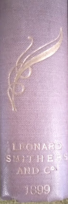
Part 3 of the series, written by Steven Halliwell and Michael Seeney, is called Leonard Smithers, Charles Shannon and An Ideal Husband (2020). It deals with several issues: reuse of a (perhaps earlier) binding for An Ideal Husband, variant spine titles and binding variants for The Importance of Being Earnest.

Oscar Wilde,
An Ideal Husband
(1899):
spine design 1
[photo: Steven Halliwell]

For some inexplicable reason, one may find two different bindings for An Ideal Husband, and the variations do not concern the decorations designed by Charles Shannon, but the lettering on the spine.

Oscar Wilde,
An Ideal Husband
(1899):
spine design 2
[photo: Steven Halliwell]

A serif typeface was used for most of them, but a non-serif typeface was selected for some copies.

The difference is most obvious in the distance between the publisher's name and the year, and and there is a variant in Co where the dash under the letter o is replaced by a dot after the letter.

Wilde's bibliographer Stuart Mason (C.S. Millard) noted such a difference in typeface for The Importance of Being Earnest, published six months earlier, but not for this book. Since neither book was reviewed by the press and sales were disappointing, it is not implausible that not all copies of the editions were bound at the same time, especially if the lack of success was anticipated. And, perhaps, Mason misplaced his note? After the sales of The Importance were disappointing, it would be logical for him not to have all copies of An Ideal Husband bound at once.

That does seem the most reasonable explanation, but then it remains strange that so few copies with that variant binding turn up. Other possibilities cannot therefore be ruled out. It may be that a printing plate was made for the decorations on the front and back cover including the spine, but without lettering, or that proof bindings were used later for some copies.

[Thanks are due to Steven Halliwell for providing the scans].

Wednesday, January 5, 2022

544. Paul Lambotte

Searching for Belgian Vale Press collections - not found by the way, there seem to be surprisingly few copies of this private press in Flemish, Brussels or Walloon libraries and museums - I came across some letters by Ricketts in the collection of the Royal Library in Brussels.

The cards and notes are addressed to the Belgian art historian Paul Lambotte (1862-1939), who put together exhibitions of contemporary Belgian art in London, Brighton, Cardiff, Oxford (and elsewhere) during the Great War. At the openings Lambotte gave a talk in 'mellifluous French, aiding our comprehension of the range of the exhibition' (West Sussex Gazette, 29 April 1915). 

There was a pathetic side to some of this work, and that was many of the beautiful pictures represented architectural details of one sort and another of buildings which had been ravaged, and many of which had disappeared, and the world would know them no more.
(Oxford Chronicle, 14 May 1915)

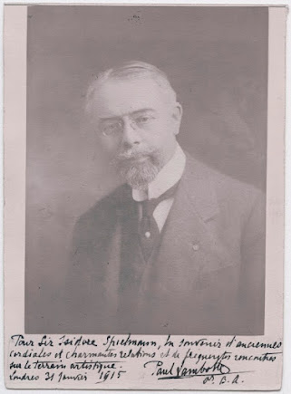
A portrait photograph of Lambotte, with a handwritten dedication to Isidore Spielmann in the National Portrait Gallery, bears witness to his English adventures and the network he maintained. He came to London in November 1914 to set up the Fund for Poor Belgian Artists. 

The Westminster Gazette reported (16 November 1914) that a large number of the artists were unable to leave their homes in Antwerp or Ghent, and funds to assist them were already exhausted. Lambotte, director at the Ministry of Fine Arts in Belgium, had been sent over to London with a number of Belgian works of art at his disposal, organising a first exhibition at the Goupil Gallery in London, a show that was opened on 18 November and closed eights days later. 

On 28 January 1915, a Belgian section - arranged by Lambotte - was added to the War Relief Exhibition at the Royal Academy. Many of the works sent from Belgium had not yet arrived, so he had to tap into his English network in order to complete the exhibitions.

Portrait of Paul Lambotte, 1915
[Unknown photographer]
[National Portrait Gallery, London: NPG x139993,
Creative Commons License]

In one of his letters Ricketts refers to this fund: 'I sincerely trust that your fund may obtain all the success it deserves. Alas! Would that real art lovers were rich!' (Undated card, probably November 1914, Royal Library Brussels, Ms II 7.133/760).


Ricketts and Shannon received Lambotte and his wife in early December and afterwards they wrote about a print of Shannon, and about a possible meeting with the collector Edmund Davis.


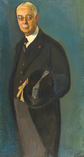
Jan Vanden Eeckhoudt, portret van Paul Lambotte (1933)
[Royal Museums of Fine Arts of Belgium, Brussels]


Wednesday, December 29, 2021

543. Ricketts's Publisher's Devices for Osgood, McIlvaine & Co. (8)

The final instalment of this series deals with the last book Charles Ricketts designed for the publisher Osgood, McIlvaine & Co., A House of Pomegranates, published in November 1891.


Charles Ricketts,
publisher's mark for
Oscar Wilde,
A House of Pomegranates (1891)


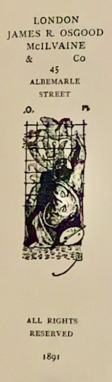
In this high-profile book, Ricketts placed the publisher's mark not on the title page, nor on the binding, but on the reverse of the title page. It has become a much more complex drawing, based on the first publisher's mark he drew for Intentions, but here the horse's wings are pointed upwards rather than horizontally. 

The publisher's mark is only partly visible here and is largely lost behind the figure of a woman with a brush; a palette lies at her side, the symbol for art and painting. She is working on perfecting the vignette. It is curious, of course, that Ricketts makes such a symbolic representation of his last publisher's mark, pointing to the artistic nature of his contribution to the book.

Some of the original drawings for this book are kept in the Eccles collection of the British Library. The one for the publisher's device is in black ink and Chinese white, 92x36 mm on white cardboard (c. 209x169 mm), signed l.r. CR (in reverse), with a marginal annotation in CR's handwriting: '5/2' centimetre (the format of the reproduction) and with corrections in Chinese white. 

The drawing was, apparently, intended to be reproduced in reverse. The handwritten letters O and M (Osgood McIlvaine) were also written in reverse: '.M .O', but were erased and replaced by 'O. M.' This has caused the image, which may have been reworked by the engraver of the block, to be blurred. It seems that the original dot before the original 'M' has not been erased completely.

Ricketts was often disappointed by the execution of his designs and that must also have been the case here.

Device No. V
November 1891. 54 x 21 mm.
Oscar Wilde, A House of Pomegranates. Verso of title page. Printed in black.

Wednesday, December 22, 2021

542. Ricketts's Publisher's Devices for Osgood, McIlvaine & Co. (7)

In November 1891 the first volume of The Bard of the Dimbovitza. Roumanian Folk-Songs appeared. Ricketts designed the title page, with a new publisher's mark, and the binding (both spine and front cover). A second volume followed in 1894.

Hélène Vacaresco, The Bard of the Dimbovitza. Second Series (1892):
spine design by Charles Ricketts (detail)

The ivory-coloured cloth cover displays three gilt ornaments of musical instruments with wheat stalks and swirls. Ricketts made two vignettes for the front cover, one of which is also printed in mirror image. They probably depict a lute and a violin, but do not strictly resemble specific Romanian string instruments. The spine has decorations of dots and heart-shaped ornaments. Two winged hearts are depicted at the top of the spine.

The device on the title page is a stylized version of the one on the front cover of Lord Arthur Savile's Crime & Other Stories.

Hélène Vacaresco, The Bard of the Dimbovitza (1891):
title page designed by Charles Ricketts

In addition to the letters 'O' and 'M', the year in roman numerals has now been added to the design. The ribbons have been retransformed to a pair of snakes.

This publisher's mark became widespread through reprints of volume 1 (1894), the publication of volume 2 (1892, and a reprint in 1897), after which the title passed to Harper & Brothers publishers in London. A 'new and enlarged edition' (2 parts in 1 volume) was published by Harper in 1902, while the same book also appeared at Scribner's in New York. In 1904 a reprint of both editions appeared. Each time, the roman numerals to the left and right of the publisher's mark were adapted.

Hélène Vacaresco, The Bard of the Dimbovitza (1892):
publisher's mark designed by Charles Ricketts

In 1908, Harper & Brother's in London published an edition. In 1911 and 1914, reprints announced as 'Complete Edition' appeared at Harper & Brother's, now based in both London and New York.

Hélène Vacaresco, The Bard of the Dimbovitza (New York, 1902)

From 1911 onwards, the year in the publisher's mark disappears.

Device No. IV
November 1891. 69 x 35 mm.
The Bard of the Dimbovitza. Roumanian Folk-Songs. Collected from the Peasants by 
Hélène Vacaresco. Title page. Printed in black.

Wednesday, December 15, 2021

541. Ricketts's Publisher's Devices for Osgood, McIlvaine & Co. (6)

As mentioned last week, the title page of Lord Arthur Savile's Crime & Other Stories by Oscar Wilde was not decorated or embellished with illustrations or illuminated initials. Ricketts designed the title page in an almost classical manner: title, author's name, place of publication and the name of the publisher are neatly centralised on the page, but between the title and author's name the word 'by' is not central; it is shifted to the right. And at the bottom, the year of publication is also placed 'too much' to the right - these words are italicised (but that also applies to part of the title), emphasising the asymmetrical design.

This asymmetry is continued on the cover.

Oscar Wilde, Lord Arthur Savile's Crime & Other Stories (1891)
Cover design by Charles Ricketts

In addition to the elongated publisher's mark on the front cover, Ricketts drew a smaller vignette for the spine and back cover. It only measures 40 mm in height.

Charles Ricketts, publishers's mark
for Oscar Wilde,
Lord Arthur Savile's Crime & Other Stories
(1891)


This is one of the most fragile bookbindings Ricketts has designed. A very thin cardboard is used for the cover, overlaid with soft salmon-coloured paper. The ink for the vignettes has run out, making the details difficult to see. For the spine device, Ricketts has omitted the name of the publisher. The image combines the two pairs of wings (that were at either side of the caduceus in the other mark) with entwined snakes curling around it; below the upper pair of wings the snake's heads come together.

Device No. III
July 1891. 40 x 10 mm.
Oscar Wilde, Lord Arthur Savile's Crime & Other Stories. Spine. Repeated on the back cover. Printed in red or brown.

Wednesday, December 8, 2021

540. Ricketts's Publisher's Devices for Osgood, McIlvaine & Co. (5)

A new, elongated publisher's mark was drawn by Charles Ricketts for the cover of Oscar Wilde's collection of short stories, Lord Arthur Savile's Crime & Other Stories, published in July 1891.

Charles Ricketts,
publisher's mark for James R. Osgood, McIlvaine & Co:
Oscar Wilde, Lord Arthur Savile's Crime & Other Stories (1891)

Once again Ricketts has drawn the publisher's name, this time asymmetrically. The letters "O" and "M" added earlier by the publisher have now been incorporated into his design. To the left and right of the mark the letters are now in his own script, gracefully balancing between the curled ribbons.

It was printed in brown or red (both colours occur) on the salmon-coloured cover. This too is asymmetrical in design: the price (two shillings) is printed vertically along the left margin, the publisher's address on the bottom left, while the title and author's name are centred at the top in the same colour.

The hands and clouds (see the earlier publisher's marks) have been omitted.

Between the curves of the two crossed horns of plenty the changed caduceus has two pairs of wings, the lower pair mercurial in design, the upper pair now looks like the wings of a butterfly.

The snakes have been replaced by ribbons.

The leaping horse also features in some marks of the Wechel firm. (See my earlier blog.)

Device No. II
July 1891. 94 x 31 mm.
Oscar Wilde, Lord Arthur Savile's Crime & Other StoriesUpper cover. Printed in red or brown.


Wednesday, December 1, 2021

539. Ricketts's Publisher's Devices for Osgood, McIlvaine & Co. (4)

When I published an article in The Book Collector in 2006 entitled 'The Revival of a Publisher's Device. Charles Ricketts and Osgood, McIlvaine & Co.', I thought that all the books that have the publisher's mark by Ricketts on the title page were actually designed by him, as opposed to books - such as those in the Red Letter Stories series - where they are (only) depicted on the binding.

It is the exception that proves the rule.

Agnolo Firenzuola Florentine, Of the Beauty of Women (1892)

Since 2006, I have only found one book that does not follow the rule, Agnolo Firenzuola's dialogue Of the Beauty of Women (October 1892). The cover title is slightly different: Dialogue of the Beauty of Women. The translation from Italian is by Clara Bell, the introduction by Theodore Child. An advertisement in The Morning Post of 15 December 1892 mentions: 'Printed on hand-made paper and bound in the "Lilly" cover, 7s. 6d'.

Agnolo Firenzuola Florentine, Of the Beauty of Women (1892):
title page

On the title page, the publisher used Ricketts's publisher's device Ia. That Ricketts himself is not responsible for the typography or the cover is shown, among other things, by some quasi-Renaissance decorations that are signed, but I have not been able to decipher the name.

Agnolo Firenzuola Florentine, Of the Beauty of Women (1892):
page [i]


Wednesday, November 24, 2021

538. Ricketts's Publisher's Devices for Osgood, McIlvaine & Co. (3)

For each of Oscar Wilde's books published by Osgood, McIlvaine & Co. Ricketts designed a new publisher's mark, but he did not do so for Thomas Hardy's books. The publishers did not commission new designs for the binding and title pages of for Tess of the d'Urbervilles (fifth edition, in one volume, July 1892), nor forLife's Little Ironies (February 1894). They simply reused his design for A Group of Noble Dames, including the publisher's mark (Device Ia).


Thomas Hardy, Tess of the d'Urbervilles
(top: second edition, volume 2, 1891)
(bottom: fifth edition, 1892)
Binding designed by Charles Ricketts

However, for the first edition of Tess, Ricketts made one of his better-known bookbinding designs with long, wavy lines featuring honeysuckle flowers and stems. The novel appeared in three volumes in December 1891. For this elaborately designed book, Ricketts did not design a new publisher's mark. It was his last assignment for Osgood, McIlvaine, and he had already drawn five different publisher's marks for the firm. It remains remarkable that this time he made no effort.

Wednesday, November 17, 2021

538. Ricketts's Publisher's Devices for Osgood, McIlvaine & Co. (2)

The publisher's mark that Ricketts had designed for Wilde's Intentions would, with a slight modification, be used almost immediately for another Osgood, McIlvaine & Co. publication, strikingly enough also a book whose title page and binding had been designed by Ricketts. Thomas Hardy's collection of stories, A Group of Noble Dames, appeared in the same month as Intentions, May 1891.

Thomas Hardy, A Group of Noble Dames (1891)
Title page designed by Charles Ricketts

The device is identical, but in a different hand the initials 'O.' and 'M.', for Osgood and McIlvaine, have been added at the top, in rather thick lines, deviating from the style of the mark.

Thomas Hardy, A Group of Noble Dames (1891)
Publisher's mark designed by Charles Ricketts


This mark was made into a stamp that could be applied to a book binding, and this was done for a series of translations published by Osgood, McIlvaine & Co under the title Red Letter Stories. They were bound in green cloth, about the same colour as Intentions. The publisher's device was not repeated on the title page. The series was not designed by Ricketts.

Guy de Maupassant, The Odd Number (1891)
[Red Letter Stories]

The first volume, Anatole France's The Crime of Sylvestre Bonnard, translated by Lafcadio Hearn,  appeared in June 1891, and subsequent volumes included Paul Bourget's A Saint and Others (translated by John Gray, September 1891), and Guy de Maupassant's The Odd Number (translated by Jonathan Sturges, October 1891). As far as I know, there were eight volumes in this series and they were printed in cloth, but each volume also appeared in a paper cover - I have not seen any of those.

Device No. Ia
May 1891. 35 x 20 mm.
Thomas Hardy, A Group of Noble Dames. Title-page. Printed in black.
Identical to Number I, except for the initials O. and M. at the top. These handwritten characters may have been added by the publishers.
(Cf. Paul van Capelleveen, 'The Revival of a Publisher's Device. Charles Ricketts and Osgood, McIlvaine & Co.', The Book Collector, volume 55 No 3 (Autumn 2006)

Wednesday, November 10, 2021

537. Ricketts's Publisher's Device for Osgood, McIlvaine & Co. (1)

From 1891 onwards, by virtue of Oscar Wilde, Charles Ricketts was commissioned  to design book covers (and sometimes more) for commercial publishers. In 1891 a series of books was published by James R. Osgood McIlvaine and Co: three books by Oscar Wilde, three titles by Thomas Hardy (in various editions) and a work (in two volumes) by Hélène Vacaresco. Most of these were reprinted several times, but the Wilde volumes least of all.

Oscar Wilde, Intentions (1891):
title page designed by Charles Ricketts


The first book in this series was Oscar Wilde's Intentions, which appeared in April 1891 and was reprinted once by this publisher in May 1894. 

James R. Osgood (1836-1892) was an American publisher who ran a successful business with several partners until he went bankrupt in 1885 and started working for Harper's Magazine. In 1891, together with Clarence Walworth McIlvaine (1866?-1912), he started a new firm in London: Osgood, McIlvaine & Co., whose first issues were reported in The Publishers' Circular of 25 April 1891. The books were published simultaneously in London (by Osgood) and New York (by Harpers Bros).

Ricketts designed a unique cover for each of these books, but he also drew a different publisher's device for their title pages. He played with Renaissance motifs and based the device on that of the Wechel family. Over the years, Chrestien Wechel (??-1581) and Andre Wechel (1495-1554) themselves also used a series of different but related publisher's marks for their title pages, quite a few displaying 'a caduceus at the centre of the image, flanked by cornucopias and with a Pegasus above, clouds below with shaking hands' (quoted from the website of the British Museum).

Publisher's device used by André and Chrestien Wechel
[British Museum, number 1895,1031.1100]
Image © The Trustees of the British Museum
Released under a Creative Commons
(CC BY-NC-SA 4.0)
 

Publisher's device used by Chrestien Wechel,
depicted by Ph. Renouard,
Les marques typographiques parisiennes des XVe et XVIe siècles
(Paris, 1926), device 1116

Publisher's device used by Chrestien Wechel,
depicted by Ph. Renouard,
Les marques typographiques parisiennes des XVe et XVIe siècles
(Paris, 1926), device 1118


Among them were broader and slimmer marks, as shown in the accompanying illustrations. Sometimes a jumping horse, sometimes a rearing horse.

Compared to the Wechel design, Ricketts's first publisher's device for Osgood, McIlvaine & Co is more refined in execution, even elegant and compact, although a little crowded, while the elongated image refers to his Pre-Raphaelite influence, and early Art Nouveau concept.

Charles Ricketts,
publisher's device designed for
Oscar Wilde, Intentions (1891)

Device No. I
May 1891. 33 x 19 mm.
Oscar Wilde, Intentions. Title-page. Printed in black.
At the foot, two hands emerge from the clouds, enclosing a caduceus with the winged horse Pegasus on top. Two pairs of wings, two snakes and two ribbons are attached to it. Two crossed horns of plenty support the horse. At the bottom is the publisher's name, written in Ricketts's script with the last 'o' characteristically placed in the curve of the 'C'. The horse on top faces left.
(Cf. Paul van Capelleveen, 'The Revival of a Publisher's Device. Charles Ricketts and Osgood, McIlvaine & Co.', The Book Collector, volume 55 No 3 (Autumn 2006).

Wednesday, November 3, 2021

536. P.N. van Eyck and The Vale Press

Recently, the Nederlands Genootschap van Bibliofielen (Dutch Association of Bibliophiles) edited a book on Dutch auctions from the twentieth century onwards, Eenmaal andermaal! (Going Once, Going Twice), published by De Buitenkant. The Vale Press is mentioned in my article on the Dutch poet and professor P.N. van Eyck (1887-1954). During the period that Van Eyck lived in London as correspondent for a Dutch newspaper, he bought books for his friends, or, as was often necessary in the 1930s, sold books for them. He performed this mediating role for fellow poet and historian Carel Gerretson. Van Eyck offered a number of private press editions to the Zwemmer firm in London; it proved to be a tough sell. In a report on his activities, he wrote:

The few Doves Press books are the most valuable but they are not among the most expensive. All under ten pounds, seven or eight at the most I think, and that is the selling price. Your Lucretius [Ashendene Press] could be sold at a profit. Most of the others are from the Vale Press printed on the machine, and have value but are difficult to sell. So it will take some effort and you don't say how their condition is.

William Meinhold, Mary Schweidler, the Amber Witch
(The Vale Press, 1903)

In another letter, he wrote that all private press books had decreased in value over the past year. Another factor was that the private press world had changed and that a hierarchy of publishers had arisen due to a definition of the term 'private press' constructed in retrospect, in which the possession of one's own press was considered the sanctifying factor, while historically other rankings could just as well have been justified. Van Eyck observed: 'The Vale Press is also unpopular.'

The idea had arisen that these books were not printed on a hand press. Van Eyck considered this a disadvantage and thought that the hand press provided a 'more severe colour', a 'sharper print' and a better registration, while only a hand press enabled the printer to take account of the irregularities of handmade paper. However, the Vale Press editions were indeed printed on a hand press, though not in the studio of designer Charles Ricketts, but at Ballantyne's, where a specially appointed printer was at his disposal; in this the approach differed only legally (the possession of a printing press) from that of Morris's Kelmscott Press. 

When Van Eyck's collection was sold in 1972, it turned out that he owned a single Vale Press edition: William Meinhold's Mary Schweidler, The Amber Witch. This copy, with its owner's inscription, was purchased for the Rijksmuseum Meermanno-Westreenianum/Museum of the Book (now Huis van het boek), The Hague.

Wednesday, October 27, 2021

535. An Unknown Woodcut by Ricketts

For substantial book projects, such as Daphnis and Chloe (1893), Ricketts and Shannon made several sketches that were never developed into wood-engravings, and even some wood-engravings did not make it to the finish line, even though much work had been involved. For artists who at that time had to take on all kinds of jobs in order to pay the rent at the end of the month, this was obviously a huge waste of time.

Therefore, there are only a few wood-engravings that were not used for their magazine The Dial or for one of the book projects. The British Museum, however, owns a rare print of such a wood-engraving. 

Charles Ricketts, engraving for unknown project, undated
(CC BY-NC-SA 4.0) license]
(with permission of the executors of the Charles Ricketts estate,
Leonie Sturge-Moore and Charmain O'Neil)

It is not clear when the woodcut was acquired, but it was described in 1986: 'Circular design with two naked figures seated to left, holding hands; proof illustration to an unidentified publication. Woodcut'. (Beneath the woodcut, a faint show-through of the British Museum stamp can be seen.)

It is clearly not a stand-alone illustration. Between the figures the shape of a letter 'I' is visible and therefore the woodcut was intended as an initial 'I'.

Around the stem of this character 'I' the female figure seems to reach for the hand of the male figure; it could be a love couple, but probably not. It appears as if she is looking for guidance. She is not seated, but standing in a position as if she has reached the water's edge. He is crouching. A dove is depicted at the top centre.

The shepherd's hat of the male figure (left) recalls that of Daphnis in some illustrations in Daphnis and Chloe, and it is not implausible that this was an early initial for this book.

Probably unsuitable because all the initials and woodcuts in this book were eventually designed as rectangles; this one was out of place because of its shape alone.

But then there is the small flower, left above the circular woodcut (and a small capital letter 'I'?).

The cover of the first number of The Dial (1889) displays a similar small flower, next to the year of publication in the bottom right-hand corner (see Yellow Nineties 2.0: The Dial volume 1). 

Charles Ricketts, decoration for the cover of The Dial 1 (1889)


However, this one looks more like one of the printer's flowers that Ricketts designed in 1895/1896 for the Vale Press editions, which represents a small acorn. 

This ornament appears in the first publication of the Vale Press, Milton's Early Poems (1896). The second poem therein opens with the title 'The Hymn' which is preceded by the ornament. Then follows an initial 'I' for the first line of the poem which is about the naked 'Heav'n born-childe', who is joined by 'meek-eyed Peace'.

Charles Ricketts, decorations to 'Hymn' in John Milton, Early Poems (1896)

Anyway, that makes two female figures and they are not depicted in the woodcut. Besides, it is the only initial 'I' in Early Poems, so it seems unlikely that this was a preliminary study for this book.

The male figure is not only wearing a hat, it is a winged hat. He also has a winged shoe, in other words, this could represent Hermes, or Mercury. The initial might therefore have something to do with Ricketts's and Shannon's edition of Hero and Leander (1894), in which Hermes plays a role. However, there is no initial 'I' in that book and only a leaf ornament. 

The woodcut may also have been intended for one of the prospectuses that Ricketts and Shannon published from about 1891/1892.

In short: the woodcut was made for an unknown edition, but because of the ornament I estimate that it dates from the time of Hero and Leander rather than from the period before or after.