Wednesday, December 29, 2021

543. Ricketts's Publisher's Devices for Osgood, McIlvaine & Co. (8)

The final instalment of this series deals with the last book Charles Ricketts designed for the publisher Osgood, McIlvaine & Co., A House of Pomegranates, published in November 1891.


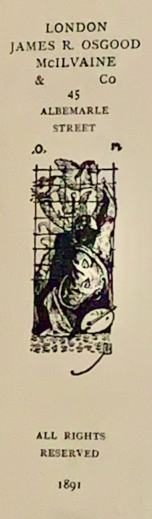
Charles Ricketts,
publisher's mark for
Oscar Wilde,
A House of Pomegranates (1891)


In this high-profile book, Ricketts placed the publisher's mark not on the title page, nor on the binding, but on the reverse of the title page. It has become a much more complex drawing, based on the first publisher's mark he drew for Intentions, but here the horse's wings are pointed upwards rather than horizontally. 

The publisher's mark is only partly visible here and is largely lost behind the figure of a woman with a brush; a palette lies at her side, the symbol for art and painting. She is working on perfecting the vignette. It is curious, of course, that Ricketts makes such a symbolic representation of his last publisher's mark, pointing to the artistic nature of his contribution to the book.

Some of the original drawings for this book are kept in the Eccles collection of the British Library. The one for the publisher's device is in black ink and Chinese white, 92x36 mm on white cardboard (c. 209x169 mm), signed l.r. CR (in reverse), with a marginal annotation in CR's handwriting: '5/2' centimetre (the format of the reproduction) and with corrections in Chinese white. 

The drawing was, apparently, intended to be reproduced in reverse. The handwritten letters O and M (Osgood McIlvaine) were also written in reverse: '.M .O', but were erased and replaced by 'O. M.' This has caused the image, which may have been reworked by the engraver of the block, to be blurred. It seems that the original dot before the original 'M' has not been erased completely.

Ricketts was often disappointed by the execution of his designs and that must also have been the case here.

Device No. V
November 1891. 54 x 21 mm.
Oscar Wilde, A House of Pomegranates. Verso of title page. Printed in black.

Wednesday, December 22, 2021

542. Ricketts's Publisher's Devices for Osgood, McIlvaine & Co. (7)

In November 1891 the first volume of The Bard of the Dimbovitza. Roumanian Folk-Songs appeared. Ricketts designed the title page, with a new publisher's mark, and the binding (both spine and front cover). A second volume followed in 1894.

Hélène Vacaresco, The Bard of the Dimbovitza. Second Series (1892):
spine design by Charles Ricketts (detail)

The ivory-coloured cloth cover displays three gilt ornaments of musical instruments with wheat stalks and swirls. Ricketts made two vignettes for the front cover, one of which is also printed in mirror image. They probably depict a lute and a violin, but do not strictly resemble specific Romanian string instruments. The spine has decorations of dots and heart-shaped ornaments. Two winged hearts are depicted at the top of the spine.

The device on the title page is a stylized version of the one on the front cover of Lord Arthur Savile's Crime & Other Stories.

Hélène Vacaresco, The Bard of the Dimbovitza (1891):
title page designed by Charles Ricketts

In addition to the letters 'O' and 'M', the year in roman numerals has now been added to the design. The ribbons have been retransformed to a pair of snakes.

This publisher's mark became widespread through reprints of volume 1 (1894), the publication of volume 2 (1892, and a reprint in 1897), after which the title passed to Harper & Brothers publishers in London. A 'new and enlarged edition' (2 parts in 1 volume) was published by Harper in 1902, while the same book also appeared at Scribner's in New York. In 1904 a reprint of both editions appeared. Each time, the roman numerals to the left and right of the publisher's mark were adapted.

Hélène Vacaresco, The Bard of the Dimbovitza (1892):
publisher's mark designed by Charles Ricketts

In 1908, Harper & Brother's in London published an edition. In 1911 and 1914, reprints announced as 'Complete Edition' appeared at Harper & Brother's, now based in both London and New York.

Hélène Vacaresco, The Bard of the Dimbovitza (New York, 1902)

From 1911 onwards, the year in the publisher's mark disappears.

Device No. IV
November 1891. 69 x 35 mm.
The Bard of the Dimbovitza. Roumanian Folk-Songs. Collected from the Peasants by 
Hélène Vacaresco. Title page. Printed in black.

Wednesday, December 15, 2021

541. Ricketts's Publisher's Devices for Osgood, McIlvaine & Co. (6)

As mentioned last week, the title page of Lord Arthur Savile's Crime & Other Stories by Oscar Wilde was not decorated or embellished with illustrations or illuminated initials. Ricketts designed the title page in an almost classical manner: title, author's name, place of publication and the name of the publisher are neatly centralised on the page, but between the title and author's name the word 'by' is not central; it is shifted to the right. And at the bottom, the year of publication is also placed 'too much' to the right - these words are italicised (but that also applies to part of the title), emphasising the asymmetrical design.

This asymmetry is continued on the cover.

Oscar Wilde, Lord Arthur Savile's Crime & Other Stories (1891)
Cover design by Charles Ricketts

In addition to the elongated publisher's mark on the front cover, Ricketts drew a smaller vignette for the spine and back cover. It only measures 40 mm in height.

Charles Ricketts, publishers's mark
for Oscar Wilde,
Lord Arthur Savile's Crime & Other Stories
(1891)


This is one of the most fragile bookbindings Ricketts has designed. A very thin cardboard is used for the cover, overlaid with soft salmon-coloured paper. The ink for the vignettes has run out, making the details difficult to see. For the spine device, Ricketts has omitted the name of the publisher. The image combines the two pairs of wings (that were at either side of the caduceus in the other mark) with entwined snakes curling around it; below the upper pair of wings the snake's heads come together.

Device No. III
July 1891. 40 x 10 mm.
Oscar Wilde, Lord Arthur Savile's Crime & Other Stories. Spine. Repeated on the back cover. Printed in red or brown.

Wednesday, December 8, 2021

540. Ricketts's Publisher's Devices for Osgood, McIlvaine & Co. (5)

A new, elongated publisher's mark was drawn by Charles Ricketts for the cover of Oscar Wilde's collection of short stories, Lord Arthur Savile's Crime & Other Stories, published in July 1891.

Charles Ricketts,
publisher's mark for James R. Osgood, McIlvaine & Co:
Oscar Wilde, Lord Arthur Savile's Crime & Other Stories (1891)

Once again Ricketts has drawn the publisher's name, this time asymmetrically. The letters "O" and "M" added earlier by the publisher have now been incorporated into his design. To the left and right of the mark the letters are now in his own script, gracefully balancing between the curled ribbons.

It was printed in brown or red (both colours occur) on the salmon-coloured cover. This too is asymmetrical in design: the price (two shillings) is printed vertically along the left margin, the publisher's address on the bottom left, while the title and author's name are centred at the top in the same colour.

The hands and clouds (see the earlier publisher's marks) have been omitted.

Between the curves of the two crossed horns of plenty the changed caduceus has two pairs of wings, the lower pair mercurial in design, the upper pair now looks like the wings of a butterfly.

The snakes have been replaced by ribbons.

The leaping horse also features in some marks of the Wechel firm. (See my earlier blog.)

Device No. II
July 1891. 94 x 31 mm.
Oscar Wilde, Lord Arthur Savile's Crime & Other StoriesUpper cover. Printed in red or brown.


Wednesday, December 1, 2021

539. Ricketts's Publisher's Devices for Osgood, McIlvaine & Co. (4)

When I published an article in The Book Collector in 2006 entitled 'The Revival of a Publisher's Device. Charles Ricketts and Osgood, McIlvaine & Co.', I thought that all the books that have the publisher's mark by Ricketts on the title page were actually designed by him, as opposed to books - such as those in the Red Letter Stories series - where they are (only) depicted on the binding.

It is the exception that proves the rule.

Agnolo Firenzuola Florentine, Of the Beauty of Women (1892)

Since 2006, I have only found one book that does not follow the rule, Agnolo Firenzuola's dialogue Of the Beauty of Women (October 1892). The cover title is slightly different: Dialogue of the Beauty of Women. The translation from Italian is by Clara Bell, the introduction by Theodore Child. An advertisement in The Morning Post of 15 December 1892 mentions: 'Printed on hand-made paper and bound in the "Lilly" cover, 7s. 6d'.

Agnolo Firenzuola Florentine, Of the Beauty of Women (1892):
title page

On the title page, the publisher used Ricketts's publisher's device Ia. That Ricketts himself is not responsible for the typography or the cover is shown, among other things, by some quasi-Renaissance decorations that are signed, but I have not been able to decipher the name.

Agnolo Firenzuola Florentine, Of the Beauty of Women (1892):
page [i]