For the first issues of the weekly Black and White a masthead (or nameplate in American English) was designed by Charles Ricketts in 1891. Due to the complexity of the drawing, in which the title almost seemed to be hidden, it was only used for a short time.
.jpeg) |
| Charles Ricketts, masthead for Black and White, 1891 |
Of course, the title had to be immediately legible and recognisable, even from a distance, in order to speed up the sale of individual issues. There were probably complaints about Ricketts's masthead, and a more straightforward (anonymous) drawing was made. [Read about this masthead and its replacement in blog 45: Lux, Ars, Spes, and Night.]
Black and White was an expensive production and of course had to sell well, targeting an international audience, or at least British citizens visiting other countries. It was on sale at Neal's English Library in Paris, at Saarbach's American Exchange in Mainz, and could be bought in the USA, Canada, Australia, and New Zealand.
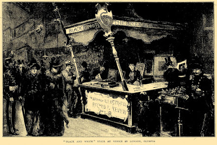
However, it is quite possible that Ricketts had already drawn other advertising material for the weekly magazine before his masthead was rejected for prolonged use. The issue of 23 April 1892 includes an image of a sales booth at Venice, London, Olympia, that seems to confirm this.
 |
| 'Black and White' stall at Venice in London, Olympia Black and White, 23 April 1892, p. 543 |
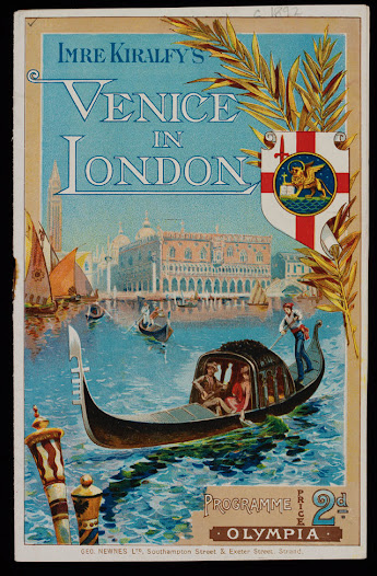
'Venice in London' was a spectacular indoor aquatic show at Olympia opened on 26 December 1891, and attracting huge crowds for more than three years.
 |
Venice in London, souvenir programme 1891-1892 [Collection V&A, London] |
There were canals and buildings that represented the Rialto Bridge, shops, glass-blowing manufactories, Venetian pleasure gardens, thirty specially made (shorter) gondolas, serenades, concerts, and a 'Grand Aquatic Carnival Ballet' with a thousand dancers. A 'Majestic Aquatic Pageant' was presented four times a day. [Read V&A curator Cathy Haill's blog about the event.]
The organisers needed £60,000 for this spectacle and advertising revenue was more than welcome. This was the ideal place to attract more customers for any product, and Black and White magazine must have paid a nice sum of money to set up a sales stall there.
 |
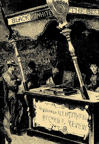
| 'Black and White' stall at Venice in London, Olympia (detail) Black and White, 23 April 1892, p. 543 |
A detail of the image of this stall shows a saleswoman with some bound volumes of the weekly magazine. The publisher sold cloth covers for bound sets (Volume I and II, at the time) for which a frontispiece, title page and index were supplied free of charge. On the left, a prospective buyer is leafing through a bound volume. But what I am interested in now is the front of the stall with a shield that contains text: '4 Weekly ILLUSTRATED RECORD & REVIEW'.
The lettering with the long tail of the 'R' for record and a similar but different tail of the 'R' for review, but especially the idiosyncratic shape of the letter 'C' after which the letter o is drawn as an afterthought, as well as the slightly to the left tilted ampersand look very much like Ricketts lettering in those years.