Z is for
The Bard of the Dimbovitza
 |
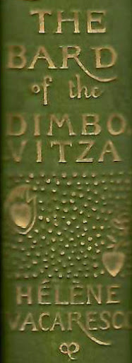
| Hélène Vacaresco, The Bard of the Dimbovitza. Designed by Charles Ricketts (detail of spine of second edition, 1892) |
At the time Ricketts was designing book covers and title pages for commercial publishers such as James R. Osgood & Co, he created a design for Hélène Vacaresco's first series of poems, The Bard of the Dimbovitza, 'collected from the peasants' as the title page proudly stated and translated from Romanian by Carmen Sylva and Alma Strettel. The first edition appeared in 1891 in a tan cloth binding and in a parchment-bound deluxe edition. Later editions and the second volume were executed in green cloth.
 |
| Hélène Vacaresco, The Bard of the Dimbovitza. Designed by Charles Ricketts (spine of deluxe edition, 1891) |
For the spine, a brass plate was made after a drawing by Ricketts. None of the lettering on the spine was set in lead type, but designed by Ricketts, and stamped from a plate.
This can be observed, for instance, in the difference between characters that should have been identical, such as 'T' in THE', which is sans serif, while in 'VITZA' it has serifs. Then again, the 'Z' next to the second 'T' has no serifs. The length of the tail of 'R' in the title is slightly less exuberant than that in the author's name. These characters have not been typeset.
It is one of the few times Ricketts had to design the letter Z for a title - as an initial it does not appear in his oeuvre.
 |
| Hélène Vacaresco, The Bard of the Dimbovitza. First Series and Second Series Designed by Charles Ricketts (spines editions dated 1892) |
When the second series was published - seen here in a later printing next to a later printing of the first series - the plate for the spine had to be altered and space was made for the designation 'Second Series' by replacing the word 'THE' at the top, and, in fact, the entire section above the author's name has been revised to create space. (Thanks are due to Martin Steenson, Books & Things, London, for his observation.) The lower part of the plate remained untouched. This was done by a professional at the bindery, as was the custom at the time. Ricketts was not called in to make this change after the first series was published. The short dash between 'VITZA' and the series designation is inconsistent with Ricketts's design ideas.
Publishers did not want to spend money on such changes and while authors and publishers could complain about copyright violations, for artists, this right simply did not exist.
An Index to the 2017-2023 Alphabet:
T - 382. The 2018 Alphabet: T [a special celebratory installment]