Wednesday, October 30, 2019

431. Ricketts's Death Certificate

For many of Ricketts's friends, his death came as a surprise, although they found him tired and overworked in recent years. The poet Gordon Bottomley, for example, felt that Ricketts, after Shannon's accident, showed even more grandeur than before. He wrote to Thomas Sturge Moore:


I used to revere him and think I knew what he was: but it was not until after Shannon’s calamity that I realised all his grandeur as well as greatness. Every time I was with him after that he opened out more and more: and I used to come away with a new awe mingling with my ancient admiration. There was one night when he kept Emily and me sitting late, and then walked with us to the ’bus, that we never forget: his loneliness, his solicitude for Shannon, the dignity and beauty of all he said made us often feel like tears if he had not been on a plane beyond them.
[Unpublished letter from Gordon Bottomley to Thomas Sturge Moore, 1 November 1931]


The gravestone of Gordon and Emily Bottomley, at Dundurn, Perthshire
[Photo: Thinair: Wikimedia Commons]
During his last year Ricketts had made a summer trip to Italy, but he was bored and felt depressed and tired. Shannon, who, after his fall, had never become himself again, 'developed a "phobia" against his studio and against Ricketts' (as Paul Delaney informs us in his biography of Ricketts). Ricketts threw himself into his work and designed dresses and scenery for Ferdinand Bruckner's play Elizabeth of England, but he couldn't handle it all, and asked Henning Nyberg to complete his work, while Bruce Winston saw after the costumes.

His doctor treated him for indigestion, and it was said to be nothing serious. In the early  morning of 7 October 1931, his man-servant Percy Nicholls brought Ricketts his medicine. When Nicholls  returned a few hours later, Ricketts had died in his sleep of heart failure. Delaney adds: 'Indeed, one might say he had died of a broken heart.'

What then follows are stories about the cremation, the memorial service and the scattering of the ashes. But in the meantime some events had occurred and they were due to the doctor's misdiagnosis.

Here is what Thomas Sturge Moore wrote to Gordon Bottomley on 21 December 1931:

The doctor diagnosed Ricketts['] case quite wrong and gave him exactly the worst treatment, and then refused to sign the death certificate so that the police took his poor body away for a couple of days for Dr Spillsbury to examine. As Jackson says if any man ever died of a broken heart it was Ricketts. [...] But I expect Nyberg has written all the details to you. And I suppose they ought to be forgotten. 
[Unpublished letter from T. Sturge Moore to Gordon Bottomley, 21 December 1931]

Indeed, Nyberg had written Bottomley, but he hadn't touched on these sinister details.

Bernard Spilsbury, c. 1925
[Photo: Official Home Office photograph]
[Wikimedia Commons]
Bernard Spilsbury (1877-1947) - Moore added a letter 'l' to the name - was a famous pathologist who performed thousands of autopsies following sudden deaths, including murder victims, but he also examined the bodies of executed criminals. Ricketts's sudden death needed to be examined.

These fragments are published as a prepublication of the forthcoming online edition of the complete correspondence of Thomas Sturge Moore and Gordon Bottomley, which is being prepared by John Aplin for InteLex Past Masters. 
I am very grateful to John Aplin for agreeing to this pre-publication.

Wednesday, October 23, 2019

430. Ricketts In Wilde's Lifes

In this blog, I haven't mentioned the new biography about Oscar Wilde before, but the book is a good opportunity to see how both biographers - Richard Ellmann and Matthew Sturgis - deal with Charles Ricketts.


Richard Ellmann, Oscar Wilde (1987): index (detail)
The lemma Ricketts is the most elaborate in the index of Ellmann's biography Oscar Wilde (published 1987). There are twenty references. In most cases they do not refer to Wilde's meetings with Ricketts, but to stories that Wilde told and that Ricketts published in his Recollections of Oscar Wilde (1932). This applies to almost half of the references. In one case Ellmann refers to the letters and diaries published in Self-Portrait (1939).

Ricketts is only mentioned in passing as the designer of Wilde's books. Much more attention is paid to the coterie of the Vale and The Dial in connection with John Gray, one of Wilde's lovers, to copies of Wilde's books that Ricketts received, and to the possibility that he was a model for Basil Hallward in The Portrait of Dorian Gray. The role of designer of Wilde's books is almost neglected. Ricketts's role in Wilde's life was mainly limited to the years 1890-1895, and from 1905 onwards with his designs for the posthumous Wilde publications.

There are no portraits of Ricketts or reproductions of Wilde's books in Ellmann's biography.


Matthew Sturgis, Oscar. A Life (2018): index (detail)
Wilde's fame has not diminished since 1987, on the contrary; in 2018, the new biographer Matthew Sturgis no longer even mentions Wilde's surname in the title of his biography: Oscar. A Life. We don't recognise any Oscar - except Wilde.

Only fourteen references to Ricketts are included in Sturgis' index. Sturgis approaches Ricketts in a different way: not as a source for stories about Wilde, but as a designer and friend of Wilde throughout the book. In only two cases does he quote Ricketts's Recollections as a source for stories about Wilde and others. Most of the passages are about Ricketts's designs for The Picture of Dorian Gray, The Sphinx, and other books. Evidently, he had Delaney's biography of Ricketts at his disposal (which had not yet appeared when Ellmann wrote his biography), but he also cites earlier works such as the memoirs of William Rothenstein and Charles J. Holmes, and he quotes from Wilde's letters. From this he found a nice phrase about Ricketts's advice to join him in a Trappist monastery after prison (imagine them together in  monastery cell), and another letter in which Wilde expects Ricketts and Shannon to visit him at the end of his life: 'those good kind friends of mine'.

This is how Sturgis treats both artists, Ricketts and Shannon: as good friends of Wilde and as his most important designers. In this way he does more justice to their unique relationship with the author than Ellmann did.

However a few small mistakes are to be regretted. He erroneously calls A House of Pomegranates 'The House of Pomegranates' and still thinks (despite our little book about Ricketts's mother!) that Ricketts was half French. He was half-Italian!

Sturgis' biography does not contain images of Ricketts's designs either, but there is a double portrait of Ricketts and Shannon: a well-known lithograph by William Rothenstein. 

Matthew Sturgis, Oscar. A Life (2018): endpapers
And then, there are the endpapers: they have been decorated with a design after Ricketts. Now this is truly to be regretted. The design is not justified and was created by maltreating Ricketts's original design for the binding of Wilde's Poems. 

This in itself was a misjudgement, and the art editor did not realize that Ricketts had also designed the endpapers for the 1892 edition of Poems - with a different design - that should have been chosen instead,  and then, of course, in the perfect design of Ricketts himself, and not in a bad arrangement.

The red colour is passable. But the subtlety of the original has disappeared. We can't blame the author for this, but we can blame his publisher. Shame!

Wednesday, October 16, 2019

429. Ricketts's Erotic Sphinxes

Occasionally, in search of literature on illustrations and book covers, you'll come across an article that surprises you. Recently I read some chapters in Gerard Curtis's Visual Words. Art and Material Book in Victorian England. The book dates from 2002 and contains a chapter on the visual impact of books, as the author states: 'from their relationship with busts in libraries to their use as symbolic and iconic manifestations of sexuality and death, and as objects sublimating morality and mortality'. This chapter is called 'The empty biscuit tin'.

Charles Ricketts is mentioned in this chapter (not in the index):

Literary culture dressed up its desires, clothing the object in preparation for the tantalizing opening of reading and its abstract pleasure by decorating both the cover and the inside of the book. Such dressing-up heightened the erotic attraction, linking sensual physicality and textual abstraction. Indicative of this unfolding of textual pleasure were the numerous erotic bookplates and markers designed by artists like Aubrey Beardsley, and by various artists in Germany and France. These sensual bookmarks and ownership tags demonstrated the intensification of the sexual element of book-ownership that arose in the latter part of the century, particularly under the influence of the Aesthetic movement.
(pp. 253-254)


Aubrey Beardsley,
Mr. Pollitt's Bookplate
These are difficult assertions to substantiate. In Germany, for example, there had certainly been an increase in erotic bookplates, but has this not been due to the increased private publishing of erotic works in small editions? Whereas in England privately printed books often commemorated deceased soldiers, or other family members, in Germany this kind of publication was often erotic in nature. There was a growing industry of pornographic luxury publications in France and Germany. The collectors adapted their bookplates. We never see this erotic type of bookplate in the more decent editions, the private press publications, for example, of the Kelmscott, Doves, and Vale Presses.

Curtis assertions are made in a paragraph called 'The breast-bound book', which, by the way, is Marcel Duchamp's cover for Le Surréalisme en 1947. This is an indication of the ease with which Curtis jumps back and forth through time, from an example from 1863 in which books by female and male authors are not allowed to stand next to each other on the bookshelf, to a period in which sexuality was commented on and shown in a different way. His assumptions are not always based on facts. In this context Ricketts is mentioned.

Given the high percentage of publishing costs spent on binding alone, the widespread attention to bindings and their designs by publishers show how there was an economic return on catering to both the commodity and fetishistic reliquary value of text. Indeed a considerable  number of covers from the period featured comely women, making the textual attraction quite specific. 

Curtis mentions Louis Legrand's binding for Erastène's Cours de Danse Fin de Siècle (1894) with the 'grasped spread-leg of a Cancan dance', and Aubrey Beardsley's illustration for a prospectus advertising The Yellow Book, displaying 'a sensual woman, clad in black, and out alone at night, preparing to pick out a volume at a bookstall'. In between, he mentions Ricketts:

Charles Ricketts's erotic sphinxes on the binding of Oscar Wilde's The Sphinx (1894), were complemented on the frontispiece by a topless female  wrapped in vines.
(p. 254)


Charles Ricketts, binding for Oscar Wilde's The Sphinx (1894): detail of front cover
While Legrand and Beardsley undoubtedly had erotic intentions with their illustrations, this applies to a lesser extent to Ricketts, especially when it came to female figures, who do not always seem to be drawn from nature. The breasts of the sphinxes, for example, are extremely stylized.


Charles Ricketts, binding for Oscar Wilde's The Sphinx (1894): detail of back cover

Wednesday, October 9, 2019

428. Phoenix and Unicorn

The small exhibition at the Rotunda of the Old Library at Dulwich College in London (see blog 425) ends on 17 October. Requests to visit should be addressed to the Director of Art and Design Technology, Sue Mulholland. (See here for her email address). A catalogue is available at the same email address.

Exhibition 'Phoenix and Unicorn', Dulwich Gallery, September 2019
[Photo: Cas Piggott]
The curator (Jan Piggott) kindly mailed me some images made by his wife, Cas Piggott. They show the five display cases with books and prints from his collection, and on the wall are reproductions and texts. Originally, the exhibition was supposed to be more extensive and obviously the selected works hardly fit in the showcases. The books are lying on top of each other. Only a private collector can do that. A museum or library would not give permission for this nowadays because of the strict climate and display requirements. This presentation is prove of the collector's insatiable appetite and admiration for the work of Thomas Sturge Moore.

Exhibition 'Phoenix and Unicorn', Dulwich Gallery, September 2019
[Photo: Cas Piggott]
The work of Thomas Sturge Moore is shown between that of his contemporaries Charles Ricketts and Lucien Pissarro. There are some remarkable exhibits, such as the original woodblock for the engraving 'The Centaur's First Love', that is always associated with the Vale Press edition of Maurice de Guérin's The Centaur, and The Bacchante. (1899), translated and illustrated by Sturge Moore. This wood-engraving was not used for the book.

T.S. Moore, 'The Cantaur's First Love' (block and print)
[Photo: Cas Piggott]

The block was among some seventy blocks given to the St Bride Printing Library by Leonie Sturge Moore. This block has been kept in an envelope, and is accompanied by a print. It is shown with the artist's tools.


Exhibition 'Phoenix and Unicorn', Dulwich Gallery, September 2019
[Photos: Cas Piggott]
Moore engraved some ninety blocks; the images did not reach a very large audience. His bookbinding designs did reach a wider public, especially the ones he designed for a large number of William Butler Yeats' later books of poetry and prose, such as Reveries over Childhood and Youth and The Cutting of an Agate. These elegant and symbolic designs were seen by most contemporary readers of Yeats' work.

The opening, I heard, was a special event, attended by four Sturge Moores, two Binyons, and a Pissarro. 

Wednesday, October 2, 2019

427. A Dedication Copy of Dorian Gray

Next Monday, on 7 October, a deluxe copy of Oscar Wilde's The Picture of Dorian Gray will be auctioned at Christie's in Paris.


Oscar Wilde, The Picture of Dorian Gray (1891)
Deluxe copy No. 74 (design: Charles Ricketts)

This is a special copy, No. 74 of 250 signed large paper copies, containing an inscription by Wilde to the French author Pierre Louÿs: 

Given to 
Pierre Louÿs
by his 
friend
Oscar Wilde

in London:
in June:


Dedication to Pierre Louys in
Oscar Wilde, The Picture of Dorian Gray (1891)
Deluxe copy No. 74 (design: Charles Ricketts)
This copy was auctioned in 1926 with Pierre Louÿs' collection. Purchased by Dr. Lucien Graux, who placed his bookplate in it, it was auctioned again in 1957. Now, the estimated price is: €30,000-€40,000. 

In 1891, the original price of a deluxe copy was 21 shillings.

PS (7 October 2019): 
Price realized (hammer price plus buyer's premium): €100,000.

Wednesday, September 25, 2019

426. Exhibition Catalogue Design 1898

For the 'First Exhibition of Original Wood-Engraving' in the Dutch Gallery, E.J. van Wisselingh's London art gallery, a catalogue was designed by Charles Ricketts and printed at the Ballantyne Press. The show opened on 3 December 1898.

Such catalogues, usually, were not subject to criticism, but in this case D.S. MacColl, in The Saturday Review of 10 December 1898 (pp. 778-779) made an exception. 

He started out very positive:

A charming exhibition is now open at the Dutch Gallery in Brook Street. It brings together the work done in original wood-engraving by Messrs. Ricketts and Shannon and their associates, Messrs. Sturge Moore, Reginald Savage and Lucien Pissarro.

After praising Ricketts's and Shannon's work for The Dial, and their early wood-engravings for Daphnis and Chloe, and before praising Shannon's new work in another medium, the chiaroscuro wood-engravings, he paused to criticise the exhibition catalogue:


The First Exhibition of Original Wood Engraving (1898) [catalogue, page 1]

Mr. Ricketts’ later work in “Hero and Leander,” “Cupid and Psyche,” and some of his books seems to me less perfectly balanced, more strained, form sacrificed in the effort at gesture and intense expression, or swept into decorative curves. The discussion of his type and books I must leave for another time, since it demands a detailed treatment. 

The criticism only focused on the cover (also the title page):

I will only raise one point for the moment, taking the title of the catalogue as a text. This, giving the name of the exhibition and its address, is printed like the old colophons in one block without a break, and not only is it difficult at a glance to pick out and read these two statements, but the arrangement requires minor dislocations. The word “engraving” is divided between two lines; “Hanover” ends one line, and “Square” begins another. I contend that lucidity would be the gainer by a different arrangement, and decoration need not in the least suffer. 

These unfortunate truncations had been the subject of earlier criticism when the first publications of the Vale Press were given eccentric title pages in which rules of poetry were sometimes hindered by the decorations or initials. Ricketts would later express his regret about his youthful, ill-considered typographical designs, although he rejected any criticism of his fonts.

But the small catalogues for Van Wisselingh were part of the occasional printing process, which did not involve much typographical ingenuity. They were merely mentioned in passing in his own bibliography of the Vale Press - Ricketts didn't think they were important. The catalogues are now, of course, of great historical importance.

Wednesday, September 18, 2019

425. A Thomas Sturge Moore Exhibition: Phoenix and Unicorn

Tomorrow the exhibition Phoenix and Unicorn & In Conversation: Coming into the Light will open in Dulwich College (London). The exhibition consists of two parts. There is a section on Thomas Sturge Moore, curated by Jan Piggott, showing books and prints in six display cases (with additional texts). The other section shows the work of contemporary wood engravers, such as Gaylord Schanilec.

Phoenix and Unicorn & In Conversation: Coming into the Light

The phoenix and the unicorn in the title refer to some designs by Sturge Moore. Curator Jan Piggott will deliver a lecture on 14 October, 'Revival of Wood Engraving Book-Design', which will be followed by a lecture on W.B. Yeats and Sturge Moore by Roy Foster. Later, the British Art Journal will publish an article on Sturge Moore's book designs.

It may not be the great exhibition that Thomas Sturge Moore's work deserves, but nowadays it is a small miracle if a show is dedicated to one of the lesser gods of the art world at all.

To mark the event, here is a lesser known portrait of Sturge Moore, a drypoint etching by Alfred Hugh Fisher (1867-1945), not dated but probably around 1920. This copy from the collection of Vincent Barlow is a presentation proof inscribed to A.J. Finberg, author of an article on Sturge Moore's wood-engravings in The Studio (1915).


Alfred Hugh Fisher, 'Thomas Sturge Moore' (drypoint, c. 1920) (c.22.5 x 15 cm)
[Collection Vincent Barlow]
 

Wednesday, September 11, 2019

424. Advertising The Vale Press in The Studio

In blog 421 (Advertising The Vale Press Books in 1896) I wrote about the earliest advertisements for Vale Press books that appeared in weeklies such as The Saturday Review in March 1896, and I mentioned a slightly later advertisement in The Studio.

This advertisement appeared in the issue of April 15, 1896. At the end of each year, the instalments were bound together, and, as a result, single copies of this leading art magazine are rare. Morover, the advertising sections in the front and back were removed by the bookbinder, and most copies of The Studio in libraries and museums therefore lack the advertisements; a good reason to reproduce it today. It can be surprisingly hard to find a copy with the advertisements in place. The April 1896 issue had 16 pages of ads in the front and 4 pages in the back (numbered from Ad. I to Ad. XX). More ads were printed on the inside of the front cover, and on both sides of the back cover.


The Studio, April 15, 1896, page Ad. XI
The advertisement of the 'Vale Publications' appeared on page Ad. XI among advertisements for carved oak sideboards, lithographs and art books ('for the artist and student').

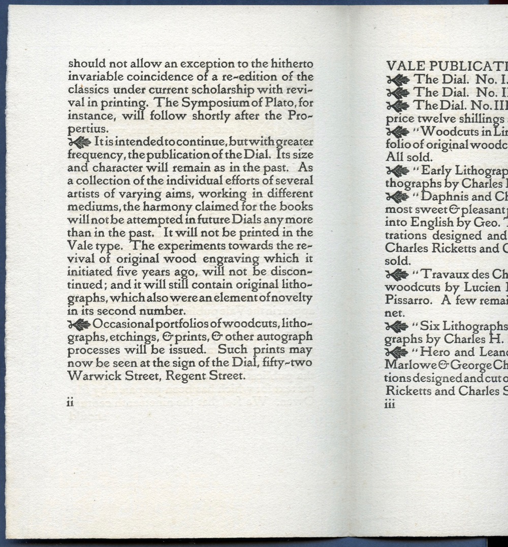
The text is reproduced after a page set in Vale Type. However, there is no separately published 'notice' or 'list' of books with this exact wording. Part of the text corresponds to that of a 'Notice' from January 1896, but the headline and intro do not appear in it.

The Studio, April 15, 1896, page Ad. XI

Notice (c January 1896)
The text and lay-out of the first column correspond exactly to the first four paragraphs of the Notice (but the last paragraph is missing). The second column begins with a text printed on the second page of the Notice, but the rest is new and does not appear in this Notice or in any other prospectus. However, the books mentioned in The Studio - from the Milton edition to The Passionate Pilgrim - are those that appear in the same order in The List of Books to be Published by Messrs. Hacon and Ricketts, at the Sign of the Dial, LII Warwick St. Regent Street. The List probably dates from February, and announces the Milton for March 1896; the other books would be ready in April and May (a claim that wasn't fulfilled). Although all these books are mentioned in the advertisement, the wording is different.


Notice (c January 1896)


The last lines - 'Prospectuses can be had on application [...]' - of course do not appear in the prospectuses themselves. At the Ballantyne Press (where the Vale Publications were printed), the text of the advertisement has been set specifically for this advertisement to display the Vale Type. It was then photographically reduced in size for a block (as illustrations were), and printed in The Studio.

Wednesday, September 4, 2019

423. Charles Shannon's Lithographs for The Savoy (2)

Charles Shannon contributed lithographs to the first three issues of The Savoy, then no more. His contributions were always prominently placed in the front, only preceded by the designs of Aubrey Beardsley. In the first issue, their contributions are followed by those of Charles Conder, Joseph Pennell, Louis Oury, William Rothenstein, F. Sandys, James McNeill Whistler, Max Beerbohm, and Jacques L. Blanche. In short, the editors had a lot to choose from, but both in this first and later issues Shannon kept his leading position.


The Savoy, 'Art Contents' (No. 2) and cover (No. 3) (both 1896)
Although these four lithographs were published in 1896 (between January and July), they all date from 1895. There is also a small edition printed by the artist himself. Of the last two lithographs, 'The Dive' and 'Stone Bath', 25 proofs are printed on two types of paper. The Savoy printed three lithographs in grey, and one in green. 


Charles Shannon, 'The Dive' (The Savoy, No. 2, April 1896)
The second number of The Savoy contained two of Shannon's lithographs (see last week's blog), the second of which was called 'The Dive', depicting (quoting Ricketts's description): 'A girl in the act of plunging into the water; her companion peeps through a doorway.' The British Museum owns one of the signed copies (not the transfer-lithograph), and it is described as follows: 'Nude girl diving into a stone pool; another female figure watching through doorway at left'.


Charles Shannon, 'The Dive', proof, signed  (British Museum)
The third number of The Savoy was published in July 1896 and contained Shannon's lithograph 'The Stone Bath', depicting 'Two nude women and a child in a bath-house; one standing and resting her head on a ledge; the other sitting and leaning forward supporting the child in the water' (The British Museum owns one of the proofs). Ricketts added that the girl on the left leans on 'a parapet'.


Charles Shannon, 'The Stone Bath' (The Savoy, No. 3, July 1896)
Rainforth Armitage Walker (1886-1960), under his pseudonym Georges Derry, published an essay on Shannon's lithographs ('The Lithographs of Charles Hazelwood Shannon', in: The Print-Collector’s Quarterly; December, 1914, p. 392-420) in which he praises these two works as part of a series of Stone-Bath lithographs:

Each one is marked by some particular quality of pose or grouping, charming either from its originality or its gracefulness. For instance, in The Stone Bath [...], the delicately drawn thigh and right leg is beautifully contrasted with the angle of the stone against which the figure leans, and the whole body is given a vitality - almost a color - from the contrast of living, muscular flesh with hard, smooth stone. Again in The Dive [...] the sense of quick motion is given by the wisp of hair which flies up, from the sudden plunging forward of the figure.

From Ricketts's catalogue we know that the order of publication in The Savoy was somewhat different from the order of production of the four lithographs:
1. Salt Water (The Savoy, 2);
2. The Letter (The Savoy, 1);
3. The Stone Bath (The Savoy, 3);
4. The Dive (The Savoy, 2).

The format of both prints - the proof and the transfer lithograph - are the same, but the more attractive, less smooth paper makes the proofs look more subtle.

Wednesday, August 28, 2019

422. Charles Shannon's Lithographs for The Savoy (1)

Charles Ricketts and Charles Shannon would never contribute anything to the infamous magazine The Yellow Book. In a letter to Richard le Gallienne, Shannon wrote: 'Ricketts and I have decided not to appear in your Yellow Book, as it might lead to complications over the fourth Dial'. This issue of their own magazine was to appear in March 1896, it was long in the making (and number 3 had been published in October 1893, before The Yellow Book started). They admitted that the first issue of The Yellow Book appealed to them: 'We think the Yellow Book looks extremely well and bright' (See Books from the Library of John Lane Publisher. London, Dulau and Company Ltd., 1929, p. 98.)

Charles Shannon, 'The Letter', lithograph in The Savoy, No. 1 (January 1896)
After Beardsley was dismissed as editor of The Yellow Book, he was given the opportunity by Leonard Smithers to fill a new magazine with drawings and stories. This was christened The Savoy. Shannon would contribute four lithographs to the first three issues (January to July 1896). 

Were the lithographs in Shannon's own publications - the issues of The Dial and three Portfolios - printed by the artist from the original stones, those in The Savoy were so-called transfer lithographs. In his catalogue of Shannon's lithographs Ricketts would state:

My experience obtained while assisting or merely watching the proofing of lithographs, and clinched by the fate of prints published in the "Dial," points to there being nearly always a slight deterioration between the first printing and any subsequent issue, if the stone has been "rolled up" and put on one side even for a small space of time. In the editions of the "Dial," where as many as three hundred and ten proofs have sometimes been taken, deterioration has taken place. This disadvantage need not exist in transfer-lithography as the drawing is usually transferred to a hard surface, a polished stone (the friction in printing being thereby reduced to a minimum), on which a chalk drawing cannot be made, while several transfers can continue the reproduction indefinitely.
(Charles Ricketts, A Catalogue of Mr. Shannon's Lithographs. London, E.J. van Wisselingh, 1902, p. 19).

Printing the lithographs himself took Shannon many hours of course and since the edition of The Savoy was ten times as high as that of The Dial, there was no escaping it: the 3,000 lithographs were printed as transfers by Thomas Way. However, Shannon also printed a number of these as separate proofs on Van Gelder paper. Of 'The Letter' (published without a title in The Savoy's first number) there were 25 proofs in red and black, while The Savoy's version is in grey.


Charles Shannon, 'The Letter', proof, printed by the artist, signed in pencil (British Museum)
Shannon's contribution was highly esteemed by, for example, the critic of The Academy, and the poet Ernest Dowson.

The British Museum describes the first lithograph, 'The Letter' as follows: 'Two girls, whole-length in profile to right, huddled together reading a letter'. 

Ricketts, in his catalogue, described it more precisely: 'A slight sketch of two girls in wide muslin skirts perusing a letter.' 

The second issue of The Savoy contained two lithographs by Shannon. The first of these was called 'Salt Water' (it was printed in green). The British Museum's description gives: 'Young nude woman standing on a beach, whole-length and in profile to left, stooping slightly and holding the hands of two small children, the boy striding towards the sea and the girl leaning back'. (See The British Museum.)


Charles Shannon, 'Salt Water', lithograph in The Savoy, No. 2 (April 1896)

According to Ricketts's the work depicts: 'A young girl bather bends facing the sea and wind. She holds two small children by the hand.' Here the BM description is more detailed. Of this lithograph, Shannon printed 35 separate proofs in black, in red, and in green.

Wednesday, August 21, 2019

421. Advertising The Vale Press Books in 1896

Before the first books of the Vale Press appeared, the firm Hacon & Ricketts opened a shop, published an advertising leaflet (The List of Books...) and the fourth issue of The Dial. In the meantime, the new publisher had also announced its forthcoming publications through advertisements.

The earliest advertisements appeared in several weekly magazines on 14 March 1896. I had never seen them before (or read about them), and in order to find them, I had to browse through several complete volumes of magazines, page by page, and read through all the small advertisements. (Some of these magazines are now available digitally, but often the small advertisements are not easy to find). The Vale Press advertisements can be found among other small announcements of typists, new magazines, publisher's agencies, etc.

The Saturday Review, 14 March 1896


The advertisement appeared in several weekly newspapers. The first one I found was in The Saturday Review of 14 March 1896. On the same day The Academy and The Athenaeum published similar ads.


The Athenaeum, 14 March 1896
Probably all these magazines got the same text, but because of their own editorial instructions, each advertisement is spelled slightly different. Sometimes there are even verbal differences, an example of which is the sentence about the original spelling in which the new editions would be published.

The Editions will be printed with Spelling with which they were written. 
(The Saturday Review)
The Editions will be printed with spelling in which they were written. 
(The Athenaeum and The Academy)


The Academy, 14 March 1896

The advertisement clearly shows that the fourth issue of The Dial was for sale from 14 March. This early date was not yet known.

The text of the announcement in The Academy reads:

THE SIGN of the DIAL. – Messrs. HACON & RICKETTS, 52 Warwick Street, Regent Street, W.  – Messrs. HACON & RICKETTS beg to announce the forthcoming publication of carefully edited Books, for which a fount of type has been designed to accompany the illustrations and decorations cut on the wood by Charles Ricketts and other original engravers. The Editions will be printed with spelling in which they were written. Catalogues may be had on application. THE DIAL, of which No. 4 is now ready, will henceforth be published at their shop, 52, WARWICK STREET, REGENT STREET, W.

This advertisement did not appear in the newspapers (such as The Times) or in other magazines (such as Pall Mall Gazette), at least not on 14 March 1896. These papers did not have extensive sections with publisher's advertisements. The three weeklies mentioned did have such sections and they published reviews and lists of books published that week. 

Apart from that, these journals were aimed at an academic audience, often an audience of collectors. Reports on book and art auctions regularly contained details that would interest the bibliophiles among them. The phrase about the spelling of the classics of English poetry was of course aimed at an audience of scholars and connoisseurs.

Advertisements in The Studio and The Bookman for April 1896 have been noticed before, but these earliest advertisements are new discoveries. 

Wednesday, August 14, 2019

420. Series That Will Be Continued...

Several series of blogs I started in the past have not yet been completed. Some series have stopped halfway, others are almost at the end. Hereby my assurance that these series will one day be continued and finished. 


Charles Ricketts, initial W for Oscar Wilde, The Sphinx (1894)

Series I


On 18 January 2017 I started a series about Ricketts's initial letters, calling it 'The 2017 Alphabet'. [See blog No. 286 for the letter 'A']. The series ran through the following year, with a slight change in the title, and this a number of instalments were published this year. High time for a new one. We are almost at the end of the alphabet!


Oscar Wilde, Poems (1892), designed by Charles Ricketts
[Carl Woodring Collection]

Series II


Another series - planned as a shorter one - was about the design of Oscar Wilde's Poems from 1892. But the way it goes, as soon as you go into details, it gets complicated - the series has been discontinued for a while, but will certainly be resumed in due course. The first instalment was published on 14 March 2018 [See blog No. 346. Ricketts's Design of Oscar Wilde's Poems (1892) (1)].


'Mouse and nut' pattern, used upside-down 


Series III


The oldest series that I started, but never finished, is the one about patterned papers. The first blog on this subject (blog No. 18) appeared on 23 November 2011. I thought it would be a good idea at the time to have a series of blogs in reserve in case I couldn't think of a topic for a new blog, but that never really happened. Anyway, in this series I came across all kinds of unsolvable questions and details that needed to be sorted out first - but of course I'm just trying to live a life outside the blog universe as well, so follow-up episodes can get stuck. I feel most guilty about not completing this series. [See blog No. 18. Patterned Papers (1).]